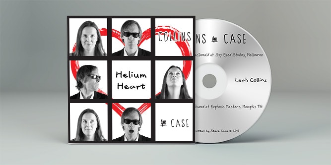
Steve Case (Helium Heart) CD artwork

My third CD artwork job for artist Steve Case involved the creation of a plain CD—it was default silver with black text—and a cardboard sleeve design. Much to my delight, Steve wanted this piece to be primarily black and white. I needed to convert most images so they appeared to come from the same photo shoot—they had not and the lighting was quite different—and the rest of the concept came together after working with Steve on his original ideas. I was once again allowed some creative license, and the finished product is what you see here.

Steve Case (Helium Heart) CD artwork
My top 10 metal versions of pop songs

Have you ever heard a popular song and thought “I don’t mind that at all! Pity it isn’t heavy metal.” I’ve had that thought plenty of times over the years. Oh, I should point out that I only hear pop songs through friends and family.

Street cred retained.

Luckily for us all, there are plenty of rock and/or metal bands who have re-recorded some of the most popular pop songs (pop pop songs?!) and I thought I’d share some of my favourites with you. Enjoy! My top 10 metal versions of pop songs

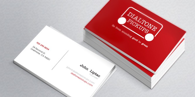
Dialtone Pickups business card

I applied the revised Dialtone Pickups logo to this business card design which will be used at the Namm Show in 2015. The business card incorporates the company’s new tagline Go from sounding good to great (as well as the logo) on the front of the card with the business contact details on the back of the card. The font used in the company logo is used to highlight the business card owner and the company URL on the back of the business card.

Dialtone Pickups business card

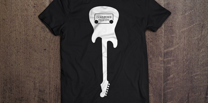
Dialtone Pickups T-shirt design

The Dialtone Pickups team were looking for a simple, single colour T-shirt design that not only used their logo, bud did so in a way that let people know what their company was about. What better way to let people know you create awesome guitar pickups than by putting your logo in a guitar (right where a pickup would go).

Dialtone Pickups T-shirt design

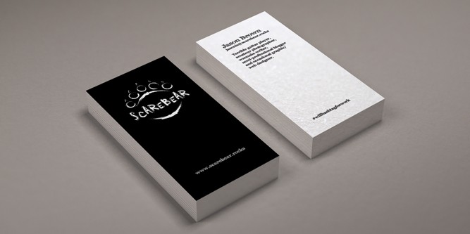
Scarebear business cards

The original website design for the Scarebear website was purely black and white. The guitars featured on that website share that same basic need for the lack of colour. When producing business cards for that brand, it was important to make sure black and white featured strongly in the design.

Scarebear business cards

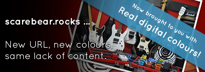
scarebear.rocks … New URL, new colours, same lack of content.

I recently became aware of a new trend on the Interweb. Colour. Some people refer to it is color, but that’s OK. You can’t be right all the time. I’ve always prided myself on keeping up with the times and at times being somewhat of an Interweb pioneer. Keeping that fiction in mind, today I introduce the all new Scarebear website. There are many changes. You’ve hopefully noticed some already. Read on if you care and I’ll share the amazing details with you. I might also start explaining the details using actual facts and less fiction.

Might. scarebear.rocks … New URL, new colours, same lack of content.

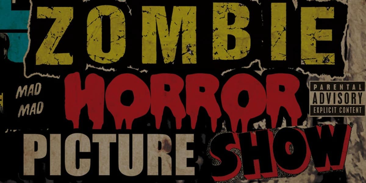
The Zombie Horror Picture Show—Review

Recently I posted an Instagram photo of my newly acquired Rob Zombie Live BluRay disc The Zombie Horror Picture Show. I’d purchased it with the Megadeth Countdown to Exctinction Live DVD (it seems near impossible to get that one on BluRay). When posting the image to Twitter I was asked politely to review the concert movie. When I say politely, I mean there was talk of flash mobs and burning Gibsons. I couldn’t allow that. I love Gibsons and I hate crowds. So, here is my own review/opinion of the Rob Zombie live concert movie that is … The Zombie Horror Picture Show.

I freaking loved it.

Pretty simple really. But perhaps I should expand on that. Oh OK, I will.  The Zombie Horror Picture Show—Review

Amaryllis release Revolt (in the most positive way)

Social media can be awesome. For example, there’s this cool website called Strumm (it’s all about guitars) that I initially came across on Twitter. I discovered this epic winning guy called Dan there. He plays guitar in a band called Amaryllis. As you can see, before I knew it I had gone from Twitter, to Strumm, back to Twitter and eventually on to the BandCamp site for Amaryllis. It was there that I discovered some truly amazing music.

Social media for the win! Amaryllis release Revolt (in the most positive way)

Lo-Fi Lullabies—Steve Case’s best release to date

I’ve been lucky enough to provide some graphic design assistance to Steve Case on some of his previous CD releases. Before that and since, I’ve been a fan of his dedication to what I consider honest and real music. He’s an artist and I’m glad I’ve managed to work with him. So, as I’ve done before with my previous semi-reviews of music I’ve had a bias towards, I continue with my music review series. If you’re lucky, you’ll get to experience this new EP by Steve and either be taken back to the times where people wrote songs that were long lasting or experience that sensation for the very first time. Either way, lucky you. Lo-Fi Lullabies—Steve Case’s best release to date